CREDIT UNION SIZE
2,800 SF
FEATURES
A Southern Vernacular Exterior, Large Lobby with Timber Trusses, and a Contemporary Feel
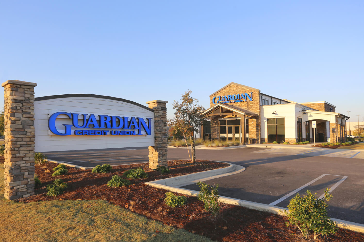
The Guardian Credit Union branch in Wetumpka, AL, builds upon a similar project Foshee Architecture completed with Guardian previously. The design has been adapted to fit this site, and maintains a contemporary, southern vernacular. Also, the interior is welcoming, professional, and personable for the members.
Firstly, the exterior includes stone, lap siding, and cement board panels. These materials reflect the southern region well. Also, the timber columns and trusses support the covered entry. In combination with the stone facade, this provides a main focal point to the front of the building. In addition, large windows allow lots of daylight into the building. Also, exterior lighting highlights key areas of the building. Finally, stone accents help to express different portions of the building.
On the interior, the design features two teller stations for members. Offices along the perimeter provide a private work area for employees. Moreover, a large waiting area and meeting room allow customers a place to relax.
The design locates the break room, safe, and restrooms discretely at the back of the branch. In addition, the remote teller station eliminates the need for a teller window. This allows convenience for both the customer and employees. Also, the drive through houses a customer ATM under the canopy.
Moreover, the interior features a central, vaulted ceiling with load bearing heavy timber beams. The dark stain applied to the timber beams allows them to stand out against the light ceiling and walls. Lobby walls are finished in a ship lap siding, painted white. In addition, sliding barn doors allow privacy for the offices. Flat screen televisions in alcoves replace traditional print advertising. Finally, the light fixtures and hardware is black finished and industrial in style.